
Our congratulations to Stockholm University and best of luck to Astrid. Read more here.


Our congratulations to Stockholm University and best of luck to Astrid. Read more here.


One of the most iconic Bergman images is the dance of death at the end of The Seventh Seal. Just ‘the image’, not ‘the sequence’, as the still image has been spread so far and wide that it has taken on a life of its own. And yet, there’s something fishy going on here.
We have this very image as our Facebook profile picture. Our friend Krister Collin of the Swedish Film Institute's stills archives pointed out that we – of all people! – should display the image the right way round. I had honestly never imagined that there was anything wrong with the still image, but Krister obviously knows much more about these things.
So here’s the issue: nearly all printed reproductions of the image, that is to say the still image, are displayed the wrong way round when compared to the film. (Egil Törnqvist also pointed this out in his eloquent article on Bergman and Visual Art.)

Also, as you can see, the distance between the lens and the motif is considerably longer (or, more likely, a lens with a shorter focal length was used). OK, so the publicity still that was taken to advertise the film was shot from the opposite angle, or perhaps the image was incorrectly copied. And…? , you’re thinking. Correct it in Photoshop; whatever you do, just make sure the image is printed the right way round!
But we have reached a bit of an archival dilemma. Anyone who has seen the film bears witness to the fact that the numerous reproductions of the still image are indeed incorrect. However, few people can see the original – the negative stored in the Stills Archives – as Krister can. Yet if one could, one would witness that even there, the negative is ‘the wrong way round’.
What is right and what is wrong? Well, I reckon that to the best of our knowledge[1] the still image should be printed from left to right, while the film scene is from right to left. Even the still image deserves the respect to be reproduced as the photographer envisioned it.
Here is another difficult question regarding the image credits. For the publicity still, the photographer in this case was Louis Huch. But what about a still image photographed from or extracted by some other means from the filmstrip? Gunnar Fischer was the cinematographer, but the composition, lighting, etc was set up for a moving image, not for a still pulled out of context (this is the very reason a still photographer was on set during filming in the first place). Thus, crediting Gunnar Fischer as the photographer of the abovementioned photograph is not a simple, straightforward, indisputable matter.
Well then. We shall continue to allow the dance of death to be displayed from left to right, out of respect for the original – which consequently in this case is a photographic still image, not a film sequence.
[1] Even though the negative of the still image shows death on the right, this doesn’t necessarily indicate that the image was incorrectly copied. Rather, the archived negative could be a duplicate negative which may have been incorrectly copied from the now vanished original, if this is the case. We have no idea. Neither the film nor still photographers are here for us to ask.


Indiana Repertory Theatre performs the Sondheim musical (based on Bergman's film) from 22 January to 16 February.


Silver Linings Playbook (David O. Russell, 2012; © The Weinstein Company)
and

And while we're at it, let's throw in another one:

In the words of Haute Auteur (hereby gratefully acknowledged):
'Dyad-based films (2013 Academy Award nominees included) know it’s impossible to go wrong if the poster pays homage to an Ingmar Bergman masterpiece.'


In 2008, Vogue Italia featured a fantastic shoot, obviously infleunced by a certain film. The coolest thing was, there were no references made in the magazine: if you didn't know your Bergman, the pastiche was lost on you.
Since then, things have snowballed. A couple of years ago, Swedish brand Hope made a collection inspired by The Seventh Seal. A short while later, both Prada and Sportmax followed.

And then there's Bergman's cap, as common a view in the Southern part of inner city Stockholm as the full beard. It is not true, however, that a border control has been established on the street Folkungatan to make sure that everybody passing into SoFo (yes, and embarrasingly enough, that's an abbreviation for 'South of Folkungagatan') would sport a hipster cap.
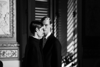
Now we hear of Erik Bjerkesjö, who at the Pitti fair in Florence the other week got to show his slightly cinematically-inspired collection (the picture above, for example – The Silence, anyone?) Sure enough, i-D wrote:
"The minimalism-crazed designers of Scandinavia needn’t look far for clean-cut inspiration and in the case of Bjerkesjö, it was Ingmar Bergman – the legendary Swedish director, who brought us Through a Glass Darkly – who played muse. The almost fetishised austerity of his darkly formal collection could, however, just as well have come courtesy of Bergman’s Italian counterpart Visconti, and the bright, gilded ballrooms of the Villa Favard certainly backed up that idea."
Bergman and fashion. That was not in the brochure. But: you live, you learn.


Read more here (in Italian).


He came to fame with his music to big budget epic Die Nibelungen (not Lang's film, of course – he was old, but not that old). Writing in the shadow of Richard Wagner, the project was called a "suicide mission".
His music to The Serpent's Egg paraphrased and quoted German music of the twenties, without Bergman knowing which music was which, as reported by Die Welt. WIlhelm also composed for In the From the Life of the Marionettes.
Rolf Wilhelm became 85 years old.


Fanny and Alexander in Serbian and Scenes from a Marriage in Portuguese. Bit of a challenge.


Expectations are high: it is an ambitious production of the play, based on Bergman's Smiles of a Summer NIght.


The small theatre Får 302 in Nyhavn stages this seldomly performed play.